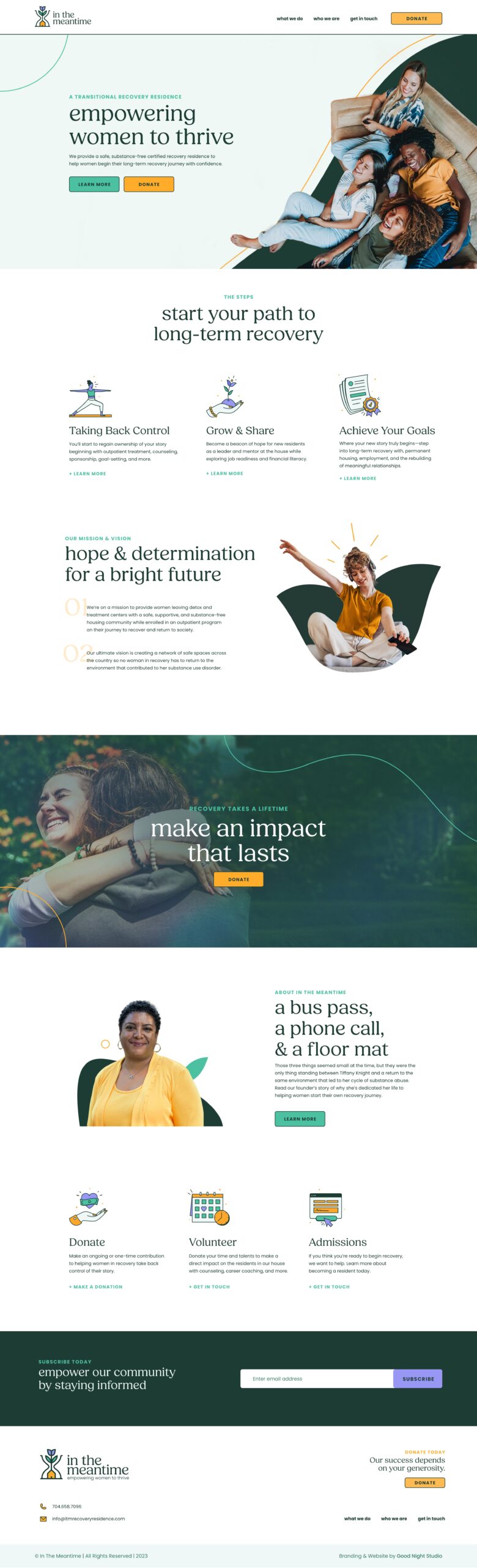
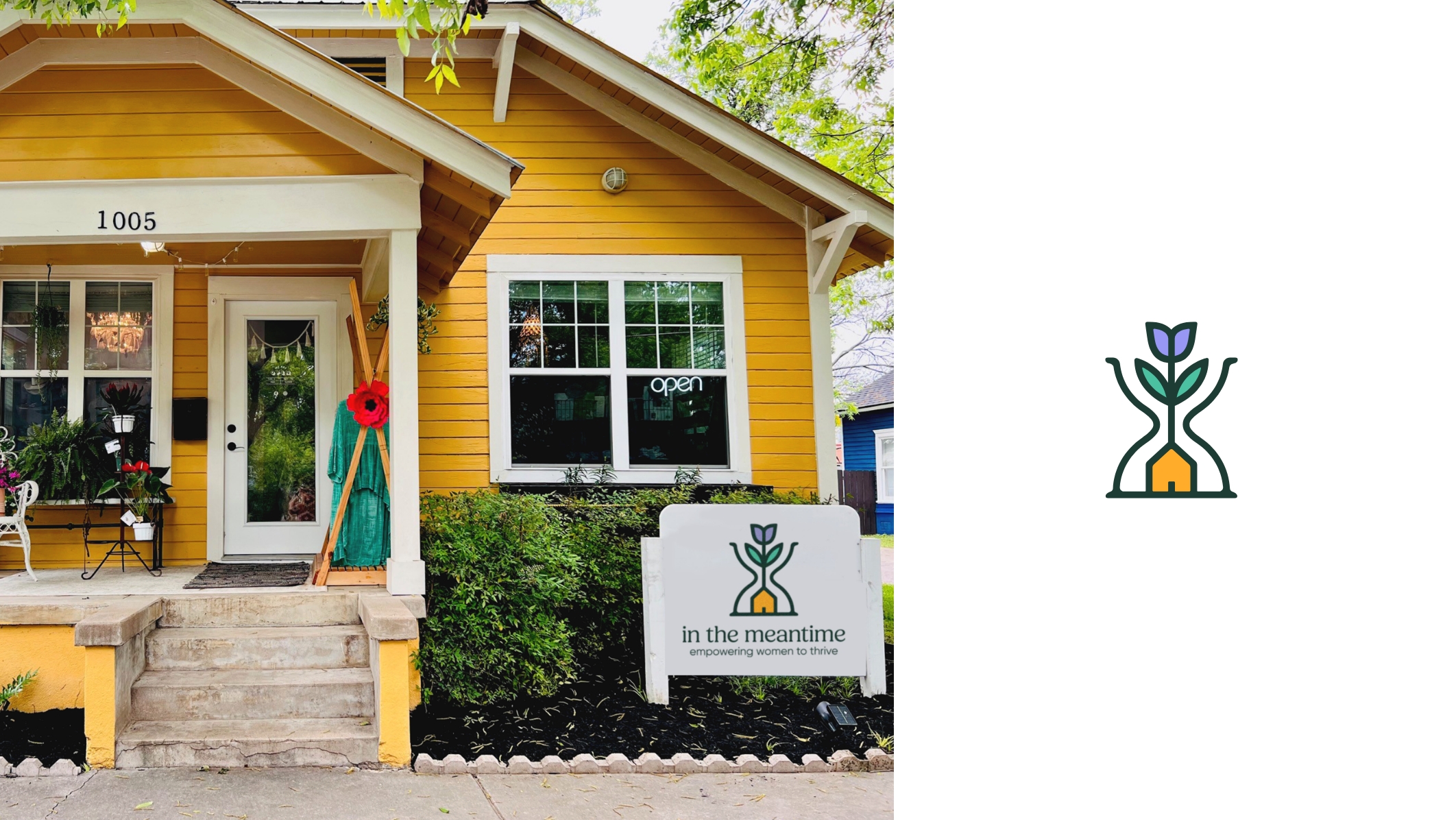
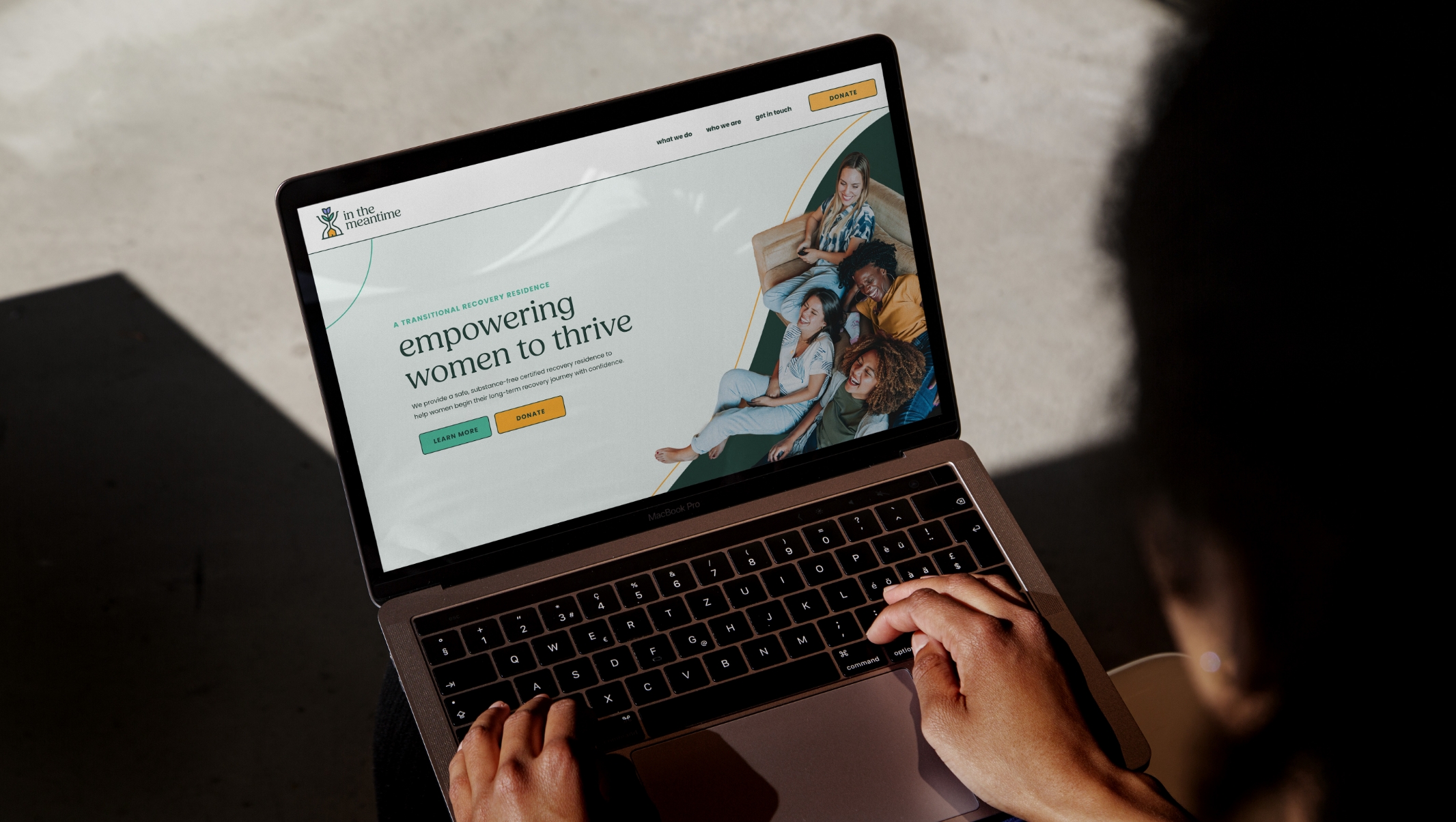
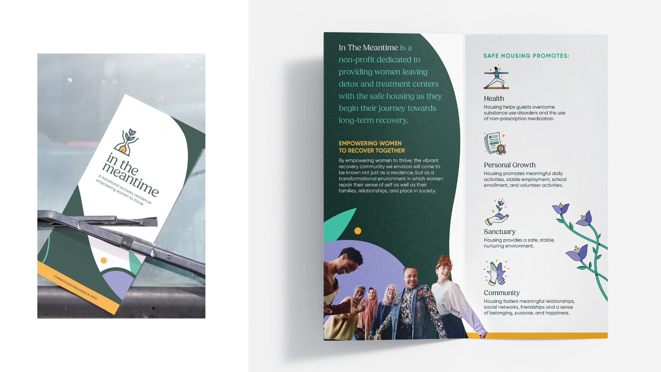
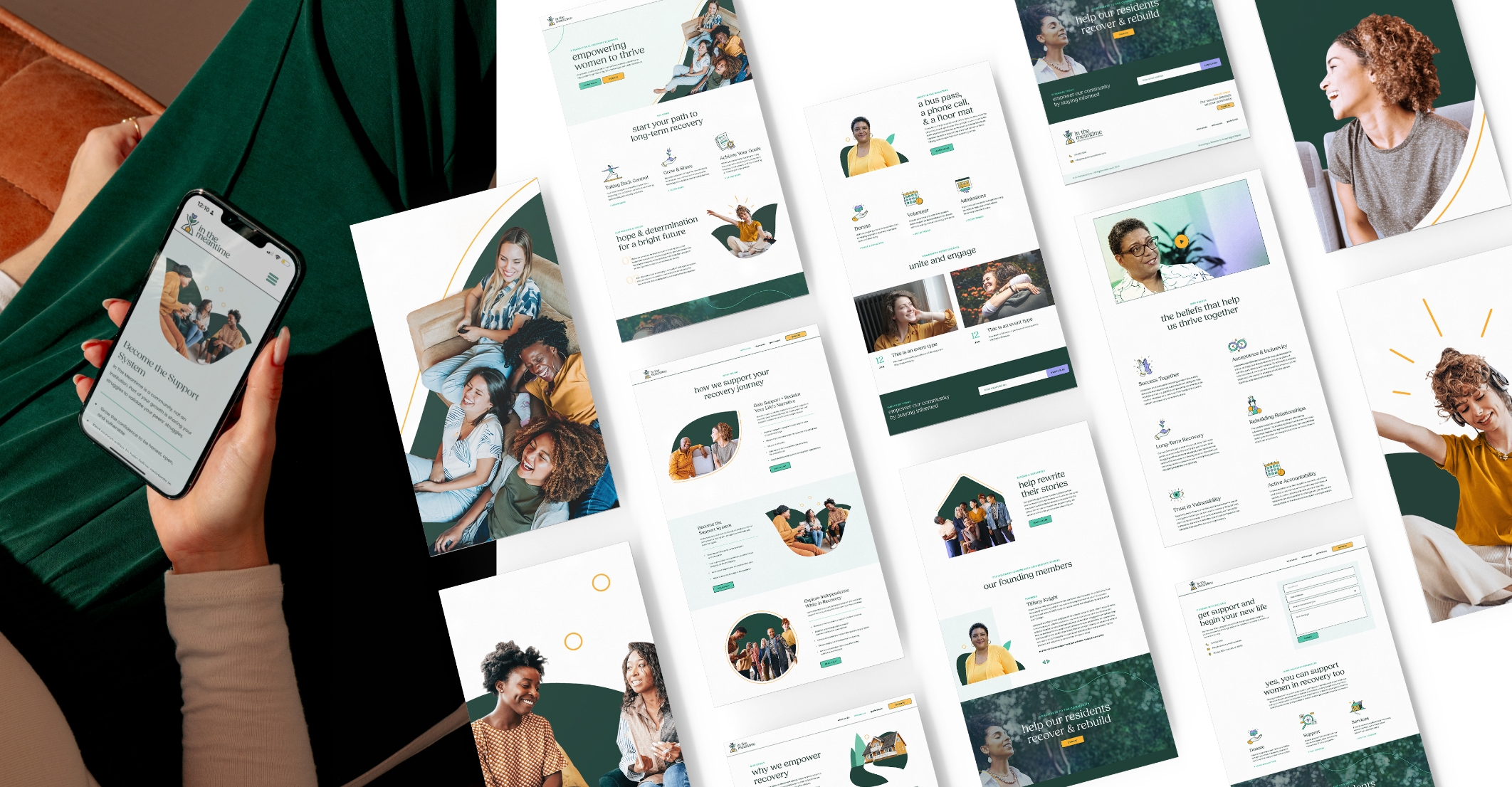
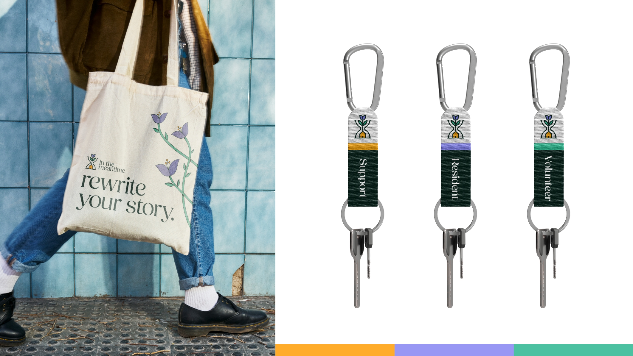
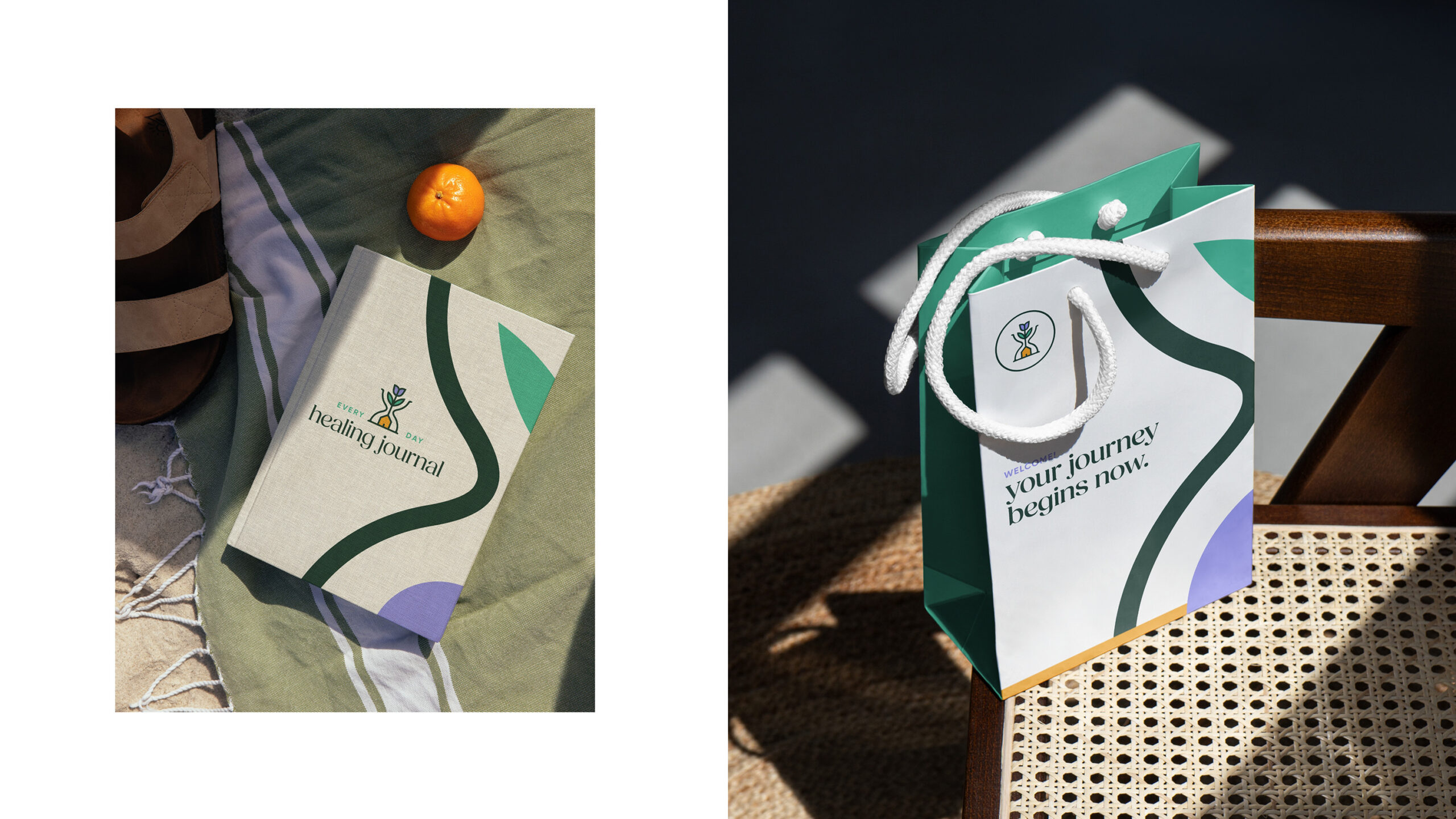
Empowering women to recover together
Women leaving detox and treatment centers often face returning to the same environments that contributed to their substance use. In The Meantime, a certified recovery residence, offers a safer alternative: a supportive, substance-free housing community. The rebrand reflects this mission with a house symbolizing the foundation of healing, a flower representing growth, and an unsealed hourglass capturing the individualized nature of recovery. A refreshed color palette—lavender for healing, gold for community, and green for growth—brings the brand’s values to life. Beyond the logo, a comprehensive style guide was created, featuring graphic assets, custom iconography, brand voice and messaging, and typography. These elements were integrated into the website, and developed in Webflow, ensuring consistency across all digital platforms.